
INTRODUCTION
Those engaged in demographic research are often interested in how and why the vital demographic processes (fertility, mortality, and migration) change in response to certain ecological, cultural, or behavioral stimuli. Today, in the midst of a global pandemic event, epidemiologists and demographers may be interested in the ability to identify points over time during which changes critical epidemiological measures such as total or all-cause morbidity, mortality, or case fatality can be estimated with statistical significance. This would allow for the identification of surging or waning of these vital processes, and can even help retroactively identify missed pandemic or epidemic activity. Thus, methodological techniques that identify significant changes in rates overtime can be valuable tools in understanding population dynamics. Joinpoint regression, also known as change point regression, is one method that can be used to identify these significant points of change. Depending on the demographic question of interest, it can be used to pinpoint locations in a time series that can be investigated further for underlying determinants of population change.
Modeling techniques like piecewise or segmented regression can be used to model changes around specific points, but these regression methods rely on the modeler to place the points of change themselves. While this, in and of itself, does not detract from the usefulness of such statistical modeling methods, joinpoint regression is specifically used for modeling rates of change during a time series, and these points of change are estimated statistically without input from the modeler on where those points might be located. Therefore, the modeler does not place the joinpoints and fit the model around those points, but rather has well-formed hypotheses about where major shifts may occur (e.g., respiratory mortality around the 1918 influenza pandemic), and the ultimate estimated location of the point may or may not support the hypothesis.
Joinpoint regression has been sparsely used despite the accessibility of the method and the ease of interpretation of results. In some recent and timely research, joinpoint regression was used to identify significant changes in tuberculosis mortality during the early 20th century with the intention of locating significant decreases after the 1918 influenza pandemic in pre-industrial, pre-urban Newfoundland (van Doren & Sattenspiel, 2021). Similar research has been performed on tuberculosis mortality in the United States that identified significant decreases in response to this pandemic (Noymer, 2011). This specific example highlights the need to consider population dynamics within the contexts of specific environments, demographic structures, and sociocultural realities of any given population. The exploration of these dynamics, however, is contingent on our ability to first identify the significant points of change.
THE METHOD
Demographic rates, such as mortality and fertility, are often calculated over some predetermined period of time to define patterns of flux and to identify temporal points for which there seem to be descriptively observed changes. It is less common for these descriptions of observable change to be statistically tested for significance, despite the underlying importance of the ability to distinctively characterize these points as such. The joinpoint regression modeling method was specifically developed to analyze rates over time and statistically determine points in which the rate changes significantly without any input from the modeler about where the point(s) may be (Kim et al., 2000).
The general model identifies points at which the slope changes significantly for observations  as seen in Equation~1:
(1) 
where  is the
  -intercept term,
  is the slope estimate before any joinpoints are identified,
  is the slope between two estimated joinpoints, is the location of an unknown joinpoint
  for
for  and zero for
  (once a joinpoint is identified, a new point should not be added for a lower value of
  ), and
  is the model error. The two primary output variables of interest are the values of and the slope estimates (
 or
or  ). One unique attribute of this method is that the slope estimates are reported in the form of an annual percent change (APC), which is a highly intuitive way to interpret changing rates over time. Despite the specificity of the name “annual percent change”, any time series can be used as the independent variable for this model, and the and estimates can rather be interpreted more generally as percent change between time steps.
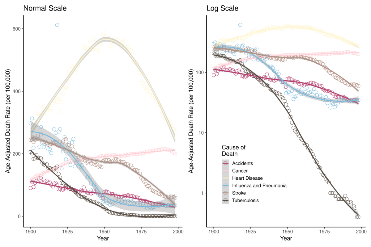
The data used in this analysis are the Age-Adjusted Death Rates for Selected Causes for Death Registration States (1900-32) and United States (1933-1998), which are freely available on the CDC National Vital Statistics System (CDC). The six major causes of death available in this dataset are: (1) accidents, (2) cancer, (3) heart disease, (4) influenza & pneumonia (P&I), (5) stroke, and (6) tuberculosis (TB). Figure 1 shows the mortality of these causes of death for the period; both the death rate and logarithmic transformation of the death rates are plotted. Visualizing the data in Figure 1 helps us develop some intuition about what the regression analysis may identify as significant points of change. For example, for the age-adjusted rates, there seems to be a clear point in the mid-20th century at which heart disease mortality decreased. Additionally, the logarithmic transformations of the mortality rates show a dramatic 20th century decrease in TB mortality. In which years did these rates significantly change?

There are two ways to model changes in rates using this method: model age-adjusted rates or model logarithmic transformations of the rates. There is a software program dedicated exclusively to joinpoint modeling: the Joinpoint Trend Analysis Software (version 4.8.0.1) built by the NIH National Cancer Institute. This is a free program to download and use, and it contains extensive functionality with options on whether to model age-adjusted rates or their logarithmic transformations. The second method is using the logarithmic joinpoint regression (ljr) package for R. This R package, as indicated by its name, only fits log models. The analyses here will focus on results of regression performed in R with ljr, but a full tutorial of analyses of age-adjusted mortality rates in the Joinpoint Trend Analysis Software in this Github repository.
The transformation is such that Equation~1 can be represented as Equation~2 with the simple adjustment:
(2) 
Critically, this regression method using the ljr package in R does not require the mortality rate as an argument, but rather requires the number of deaths per year and the population size. The only additional information this requires is the yearly population size of the United States for the years of interest, which can be found on the United States Census website. Because our mortality rates are reported as per 100,000 population, the calculation for expected number of deaths is simply:
Expected Number of Deaths = ( Mortality Rate / 100,000 ) * Population Size
RESULTS
The results of the joinpoint regression analysis using the ljr package can be found in Table 1. The output provides the slope estimates and the joinpoint location estimates, which are not always estimated as integers. We can see from the results that our intuition about changes in heart disease mortality were correct: according to the one-joinpoint model, the first and most significant point of rate change was identified sometime in 1956. As we begin to fit more points around the curve of heart disease mortality rates, they begin to fit the trend more closely: according to the three-joinpoint model, there are significant points of change in 1919, 1937, and 1963. Paradoxically, given what we know about how heart disease is one of the leading causes of death in the United States, these results make it clear that it is also one of the causes of death that has decreased the most in the last 100 years. This observation was astutely made by Gage (2005) in his paper “Are modern environments really bad for us?”.
0 Joinpoints | 1 Joinpoint | 2 Joinpoints | 3 Joinpoints | |||||
Slopes | Joinpoints | Slopes | Joinpoints | Slopes | Joinpoints | Slopes | Joinpoints | |
Accidents | -0.012 | N/A | -0.009 | 1968.4 | -0.009 | 1971.5 | 0.037 | 1921.0 |
-0.015 | -0.027 | 1983.3 | -0.057 | 1906.3 | ||||
0.025 | -0.016 | 1967.8 | ||||||
0.012 | ||||||||
Cancer | 0.0041 | N/A | 0.015 | 1927.5 | 0.015 | 1926.7 | 0.015 | 1975.0 |
-0.012 | -0.012 | 1993.2 | -0.012 | 1927.3 | ||||
-0.017 | -0.015 | 1991.5 | ||||||
0.002 | ||||||||
Heart Disease | -0.002 | N/A | 0.013 | 1956.3 | 0.017 | 1939.9 | 0.013 | 1919.0 |
-0.031 | -0.016 | 1964.4 | -0.019 | 1937.2 | ||||
-0.022 | -0.022 | 1963.7 | ||||||
0.008 | ||||||||
Influenza & Pneumonia | -0.029 | N/A | -0.001 | 1918.0 | -0.007 | 1929.0 | -0.023 | 1918.0 |
-0.032 | 0.058 | 1952.0 | 0.150 | 1914.1 | ||||
-0.061 | 0.044 | 1954.1 | ||||||
-0.190 | ||||||||
Stroke | -0.013 | N/A | -0.007 | 1968.1 | -0.007 | 1971.4 | -0.002 | 1924.2 |
-0.031 | -0.049 | 1984.4 | -0.021 | 1938.6 | ||||
0.039 | 0.024 | 1964.6 | ||||||
-0.039 | ||||||||
Tuberculosis | -0.054 | N/A | -0.036 | 1942.5 | -0.020 | 1945.0 | -0.020 | 1916.5 |
-0.064 | -0.026 | 1916.7 | -0.025 | 1948.4 | ||||
-0.054 | -0.130 | 1954.5 | ||||||
-0.094 | ||||||||
Unfortunately, the output of the ljr regression results do not provide year-by-year estimates of mortality or standard deviations of each estimate to visualize along with the data (the Joinpoint Trend Analysis Software does). We can use the estimates of τk, however, to use vertical lines at various values of x to visualize the segments of the time series for which different slopes of β and δ have been identified. Four visualizations of these data and their joinpoint estimates can be found in Figure 2.
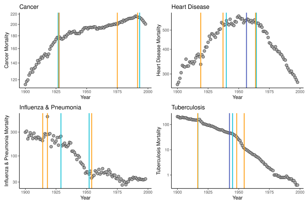
In these figures, the dark purple line is the estimate of the one joinpoint models, the light blue are for the two-joinpoint models, and the orange are for the three-joinpoint models. For some data (e.g., cancer and P&I), some model fits will not be apparent because they are either identical to or did not differ dramatically from τk estimates of models fitting a larger number of joinpoints. Most of these results support the epidemiological trends that have been observed for the 20th century: rising cancer mortality and falling infectious disease mortality. There is, specifically, a significant change to a very rapid downwards trend in P&I mortality after 1918, followed by a relative leveling-off of this cause of mortality in the mid-20th century, likely in response to availability of antibiotics that could be used to treat otherwise deadly-if-untreated pneumonia. A similar trend is obvious for TB: a significant decrease observed around the 1918 influenza pandemic with significant points of decrease again aligning with antibiotic availability. The TB trend is interesting, however, because the significant points of decline suggested by the model fits are in 1916 rather than in 1918 or later, suggesting that these significant declines were not in direct response to any kind of selective mortality effect of the co-infection of TB and P&I during the 1918 influenza pandemic. Rather, this result supports what we know of health, epidemiology, and population dynamics from the late-19th and early-20th centuries in the United States: TB mortality had already been falling for a long time before the 1918 influenza pandemic.
Joinpoint regression can model any type of rate change, such as mortality, morbidity, fertility, prevalence, incidence, migration, etc. This method is intuitive and ideal for demographic and epidemiologic analyses that either requires knowing significant points of rate change in a time series, and/or it can supplement other investigations of population dynamics in which it would be greatly useful to know points of statistically significant rate change.
Citations
Centers for Disease Control and Prevention. Age-Adjusted Death Rates for Selected Causes, Death Registration States, 1900-32, and United States, 1933-1998. National Vital Statistics System.
Gage, T. B. (2005). Are modern environments really bad for us? Revisiting the demographic and epidemiologic transitions. Yearbook of Physical Anthropology, 48, 96–117. https://doi.org/10.1002/ajpa.20353
Kim, H. J., Fay, M. P., Feuer, E. J., & Midthune, D. N. (2000). Permutation tests for joinpoint regression with applications to cancer rates. Statistics in Medicine, 19(3), 335–351. https://doi.org/10.1002/(SICI)1097-0258(20000215)19:3<335::AID-SIM336>3.0.CO;2-Z
Noymer, A. (2011). The 1918 influenza pandemic hastened the decline of tuberculosis in the United States: An age, period, cohort analysis. Vaccine, 29(SUPPL. 2), B38–B41. https://doi.org/10.1016/j.vaccine.2011.02.053
van Doren, T. P., & Sattenspiel, L. (2021). The 1918 influenza pandemic did not accelerate tuberculosis mortality decline in early-20th century Newfoundland: Investigating historical and social explanations. American Journal of Physical Anthropology, 176(2), 179–191. https://doi.org/10.1002/ajpa.24332
Computation & Reproducibility
All code necessary to implement the methods and reproduce the figures and results in Estimating time points of significant change in cause-specific mortality: Joinpoint regression in R has been archived as of publication on April 17, 2024 by the Population Dynamics Lab here: UW PopLab Github.
Suggested Citations
(2024). Estimating time points of significant change in cause-specific mortality: Joinpoint regression in R. The Denominator, Population Dynamics Lab. https://doi.org/10.6069/JK1Y-7Z16 [Accessed July 27, 2024].
and (2024). Estimating time points of significant change in cause-specific mortality: Joinpoint regression in R: Computation Supplement. The Denominator, Population Dynamics Lab. https://github.com/Population-Dynamics-Lab/joinpoint-regression-tutorial/ [Accessed July 27, 2024].
[DOI Link:] https://doi.org/10.6069/JK1Y-7Z16