• Home
  • About Us
    • About PDL
    • All Members
    • Editorial Team
    • Contributing Authors
    • Join PDL
  • The Denominator
  • The Download
  •  Repository
  • Authors
    • Guidelines for Authors
    • Submission Guidelines
    • Submit
  • Index

Four-faceted figure showing log transformations of mortality rates for cancer, heart disease, influenza & pneumonia, and tuberculosis mortality with vertical lines at points of joinpoint estimates provided by the ljr R package.

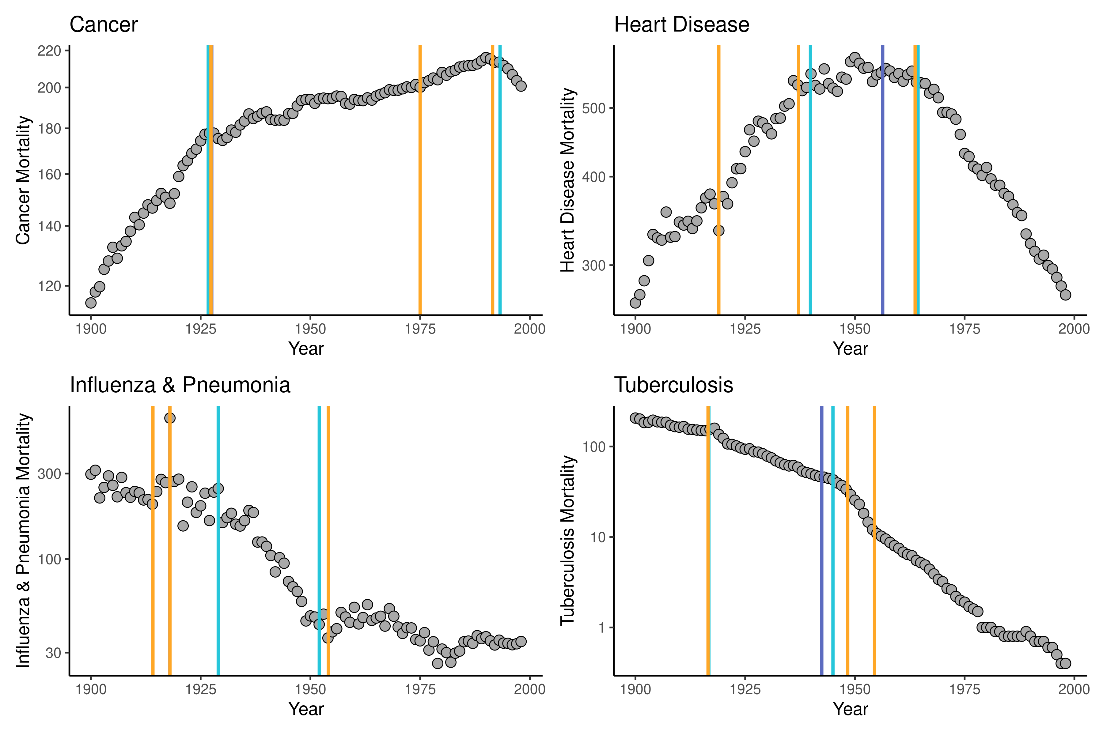
Estimating time points of significant change in cause-specific mortality: Joinpoint regression in R
Those engaged in demographic research are often interested in how and why the vital demographic processes (fertility, mortality, and migration) change in response to certain…
Taylor Doren
Apr 17, 2024

Expanding the Lifespan of Software for Demographic Analysis with Containers: An Application of Spatial Sampling
Software, such as specific R packages, evolve over time, which may prevent older analysis code from working as expected. For example, default values for arguments in a…
Egor Kotov, Esther Denecke
Apr 17, 2024

Increasing the Lifespan of Software for Demographic Analysis
Many researchers face challenges with computational reproducibility. For instance, running analysis code written just a year earlier can be problematic. Even if it worked…
Egor Kotov, Esther Denecke
Apr 17, 2024

Two plots of mortality rates for six major causes of death in the United States from 1900-1998: accidents, cancer, heart disease, influenza and pneumonia, stroke, and tuberculosis. The left image is age-adjusted mortality rates for the time period, showing a notable large increase and then decrease of heart disease and other various trends for the other causes. The right image is the log transformations of these mortality rates, showing a notable dramatic decrease in tuberculosis mortality, specifically.

Knowing and understanding change: Methods insights using historical pandemic data
Pandemic diseases, like COVID-19, have far-reaching effects that are difficult to identify or predict during the course of the pandemic itself. Case numbers and mortality…
Taylor Doren
Apr 17, 2024

Unlocking Population Estimation Using Readily Available Data
Population estimation techniques rely on past population data, number of births, deaths, and migration. While various techniques have been used to accurately produce…
Mathew Hauer
Apr 17, 2024

Figure 1: Figure 1 shows a graph depicting the correlation between voter registration and county populations in the United States. The x-axis shows the number of registered voters in 2010, ranging from 0 to 800,000. The y-axis shows the population in 2010, ranging from 0 to 800,000. It shows that there are always fewer registered voters in each county than total people. Which in turn, indicates that simply using a symptomatic indicator (in this case, voter registration) to directly estimate population would lead to an underestimation of the population.

Unlocking Population Estimation Using Readily Available Data: Applying the Simplified Censal Ratio Method
Population estimation is generally a straightforward process: any population must result from a past population number plus the births minus the deaths plus the net…
Mathew Hauer
Apr 17, 2024
No matching items

This site and the content therein
is covered by CC-BY 2.0 License.

 
To the top ↑